
Even more data mining pitfalls: Get the best out of your data
Pablo Hernández
If you follow our blog regularly (which you should if you want to learn and keep up to date with the world of Data Science in Aviation) you might have read the previous two great blog posts about Data Mining Pitfalls by Seddik Belkoura and Dario Martinez. In these blogs, you can learn about the challenges you can face in a Data Mining pipeline and the main mistakes an analyst can make when managing and interpreting Data. They cover basic concepts with which all Data Scientists should be familiar. I recommend reading them now if you haven’t had a chance prior to this. In this blog specifically, I wanted to further cover some common mistakes that are made when analyzing data due to shortcuts or preconceived notions that can ruin your work:
Summary metrics:
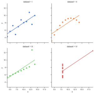
(source – https://seaborn.pydata.org/examples/anscombes_quartet.html)
When working with a dataset, we quickly tend to extract summary statistics such as averages, variances or correlations to better understand our data. Summary statistics can help us describe and understand big complex datasets. We feel pretty confident of what our data looks like when know these numbers. The reality is that summary statistics are very limited in what they can tell us of what our data represents. Statistician Francis Anscombe of the 70s wanted to expose these limitations and created what is known as the Anscombe’s Quartet. The Anscombe’s Quartet is four datasets in which each has the same mean, variance and correlation. The twist comes when we visualize these data sets (see the image above). As can be seen, the data sets are completely different from each other. Anscombe defended that the distribution of the data was as important as summary statistics. This example has been used in many cases to show the importance Data Visualization in data analysis. In the video below from MIT OpenCourseWare (OCW) you can find a great description of this pitfall as well as other Statistical fallacies that are very interesting to know.
Simpson paradox:
The Simpson’s paradox occurs when a trend in data appears for a set of individual groups but is reversed when said individual groups are combined into a single group. To better understand this pitfall, an example will be presented which you can also find in the book “The Basic Practice of Statistics”.
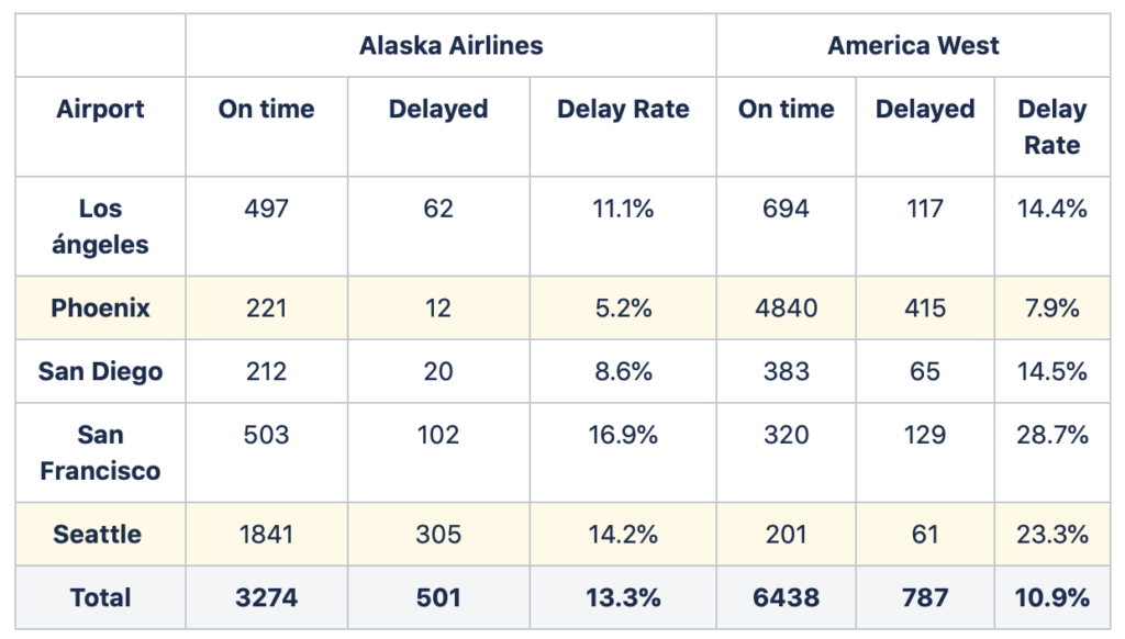
In the table above, we can find On-time arrivals data of two fake airlines for five different airports. On-time statistics of airlines are usually reported publicly. FlightStats has a great dashboard where you can find different On-time statistics of airlines from all around the world. If we look at the table, we can start to see why maybe using the totals would not be a great idea. In total, Alaska Airlines has a greater rate of delays than America West. Nevertheless, if we look at each of the airports individually, we now see that Alaska Airlines has lower delay rates in all of them. This apparent contradictory conclusion is what we can call the Simpson paradox. Why does this occur? In our example, this happens due to the difference of the number of flights each airline operates in each of the airports. In Phoenix, both airlines have similar low delay rates, though America West has more than 20 times more flights than Alaska Airlines at this airport. At the other side of the spectrum, in Seattle, both airlines have similar high delay rates – yet now Alaska Airlines has nearly 10 times more flights than America West. These differences in the number of flights at high and low delay rate airports leads to our previous results. Although Alaska Airlines presents less delay rate in each airport, when adding up the total number of flights America West ends up with a lower global delay rate. One of the best known examples of the Simpson paradox is when the University of Berkeley was sued for gender discrimination in the 1970s regarding admission to one of its graduate school. You can find an interesting blog here that describes this case as well as other real world examples of the Simpson’s paradox.
Publication bias
When reviewing existing research for our analysis, we can inadvertently face a hidden pitfall. The publication bias can be typically found in published academic research. This pitfall appears due to the fact that some studies have more chances of being published depending on their results more than the methodology used. Several articles have pointed out that, in some cases, studies that show statistically significant results tend to be published over far more unpublished, similar tests that are inconclusive. The video below is a TED talk by Dr Ben Goldacre brilliantly describing how the publication bias affects academic medicine research and why it is misleading and possibly very dangerous. I encourage you to watch it to better understand the risk of this pitfall.
Gerrymandering
This pitfall gets its name from the Governor of Massachusetts, Elbridge Gerry, who, in 1812, approved a reshaping of electoral districts in order to favor his party. One of the districts was manipulated to such a tortuous shape that, to many people, it resembled a salamander. Since then, this modification of electoral maps for political benefit has been known as “Gerrymandering”. Although this term mainly applies to the political sphere, this problem can be extrapolated to other fields where it is known as the Modifiable Areal Unit Problem. MAUP is a statistical fallacy that can occur when working with aggregated spatial data. The problem rises with aggregation into areas that could take multiple forms, as the areas selected will have an effect in the analysis. The image below is a straightforward example of how Gerrymandering/MAUP works. It clearly shows how, depending how the division into districts is made, the outcome of the election can change.
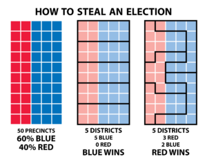
(Source – https://www.fairvote.org/new_poll_everybody_hates_gerrymandering)
Survivorship
The Survivorship’s pitfall is the last of today’s blog. When analyzing data, we can easily draw incorrect conclusions if we do not assess the origin of our data. Knowing and understanding where data comes from is essential as it can be incomplete from previous selection criteria. We may be seeing the full picture of our problem. The below case better illustrates this pitfall:
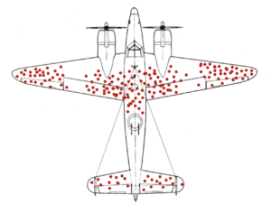
During World War II, the Statistical Research Group (SRG) at Columbia University worked with the Office of Scientific Research and Development (OSRD) in order to help the USA in their war effort. Some of the greatest statisticians at the time worked at the SRG such as W. Allen Wallis or Milton Friedman as well as Hungarian mathematician Abraham Wald. One day, the Navy wanted to know if they could increase the number of aircrafts that returned home after a mission. They believed said goal to be possible by studying and possibly protecting where aircraft were being shot, coming up with something like what you can see in the image above. Armoring an aircraft is complicated – armored without much thought to maneuverability, an aircraft’s fuel efficiency could be dangerously decreased. The Navy determined that by only armouring the body fuselage, wingtips and tail, they could increase the survivability without decreasing the overall performance. They then went to Wald to know how much armour should go over each of these parts, but when Wald saw the data, his answer baffled them. He told them that the armour should go on the engines and cockpit, where the aircrafts were being shot less. Wald argued that the reason fewer bullet holes were found in these places was due to the fact that aircraft shot here were not making it home and therefore not included in the analysis. For Wald, the data showed where an aircraft could be shot at and still make it back home. Abraham Wald did extensive research on Aircraft Survivability, which was used not only in World War II but also in Korea and Vietnam.