Apologies in advance for starting this blog post with a disappointment. Before you decide whether you want to keep reading or not: There is no universal rule, nor a definitive guide, for data visualization. Hence why this post is not a “ten tips to create the perfect graphic for your data visualization”. Googling that exact sentence yields an infinite number of results. And yes, there are some things to have in mind such as don’t use high-contrast color combinations such as red/green or blue/yellow. Without discounting the idea of a future post with clearer and simpler rules, this post aims to go beyond the “design rules”. Will you give this post a go?

This is not a data visualization guide
Inés Gómez
2019-02-07 11:30:18
Reading Time: 3 minutes
Do you need a graphic?
This may seem obvious but is the simple and first question that you need to ask yourself. Is the data so complex that you need a graphic to explain it to the reader? Or do you just want to make things look nice and waste the reader’s time? Consider that if you add an image, the reader will look at it before reading the text, and if she sees the same information twice, she will be bored and disappointed.
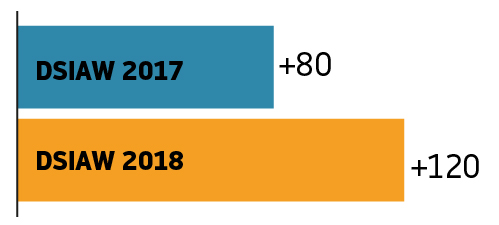
As if I told you that +80 people attended the 2017 DISAW and +120 attended the 2018 edition. I am sure you knew this before reading it! If you are going to be redundant or helpless, maybe avoid the visualization. Otherwise, go ahead!
Organize your thoughts and then the data
You need to be familiar with the data to understand it. It does not mean you need to be an expert on what the data is about, it means you need to know what is there to represent. Sometimes we are given numbers, entire paragraphs or even another set of graphics to improve. If we know what is there to represent, then we will just have to think how to properly visualize it. Keep in mind that the more time you take to get this done, the less it will take the reader to understand your final graphic!
Think before you start, and decide.
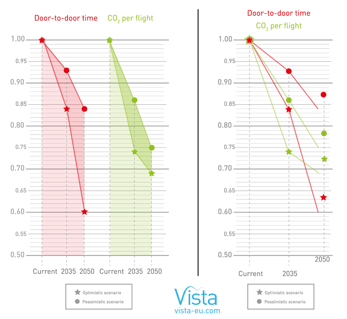
After you have deeply analyzed the data given, you need to decide —or follow the briefing— on what you have to communicate within that data, in order of importance. For instance, on this graphic taken from the results of Vista project: Both approaches are valid and the data is the same, but the difference between the graphics is that the one on the left shows the difference between the Current, 2035 & 2050 scenario on Door-to-door time and CO2 per flight, whereas the right one shows the difference between Door-to-door time and C02 per flight in each scenario. It seems the same but it is not! So make sure that you place first the most important fact of the data that you want to communicate.
Avoid extra visual information.
Yes, we are tired of hearing it but here also less is more. The main goal is to visualize the data in a clear way! Once you have drafts for your graphic, look at it and think if you can make it more simple. Then avoid adding extra visual information that does not help the reader understand the data or add information about it. Forget about making things look nicer or “more artistic”. This will come later, if necessary!
Review the work done
Once the first version of the graphic is done (come on, we all know that changes are part of the routine), review it to make sure that:
- You show the data given
- You avoid distorting what the data has to say
- First comes first: the main messages about the data are clear.
- You encourage the eye to compare pieces of data, in a simple way!
- You should always ask someone else to check your graphic and see if they understand it. Feedback is always a good way to learn. Another one is trial-and-error – the more graphics you put together, the easier it becomes to organize the data in your mind and reflect it with a simple image.
If you still want a “how-to” guide for data visualization, comment here or email us at [email protected].