Data visualisation has entered the data science landscape with force! It has become an essential tool to master for any upcoming data scientist. Why is Data Visualisation important? The human brain processes information quicker and more efficiently when data is in graphical form. As a result, charts and images tend to speak more efficiently and effectively than words or numbers following the idiom that “a picture is worth a thousand words”. To understand how we are able to interpret data visualisations so effectively, it is important to understand how our brain perceives and processes information. In this blog, I want to talk about one of the aspects of this process: Preattentive Processing.
Preattentive processing can be described as the processing of sensory information that occurs before the conscious mind starts to pay attention. When talking about visuals, preattentive processing extracts basic visual features of the complete visual field. This processing is extremely quick and takes just about 200-500 milliseconds. Preattentive attributes and properties are what make elements of visualisation “pop-out” and easier to understand. Knowing and understanding these properties is a must for anyone trying to harness the power of visualisations. In his book “Information Visualization: Perception for Design”, Colin Ware presents four categories of preattentive visual properties:
- Form
- Color
- Movement
- Spatial Positioning
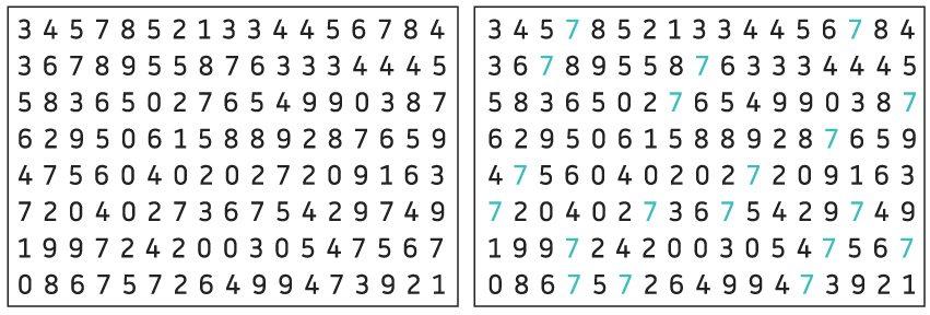
The most widely used example of preattentive attributes is below. Look only at the left image and try to count the total number of number 7s in the set. How hard was it? Now, try the same thing but using the image on the right. How hard was it now? In the first image, you had to tediously search for 7s in different rows and columns. In the second image, the difference in color between the number 7s and the other numbers is a preattentive attribute that made the recognition almost instant.
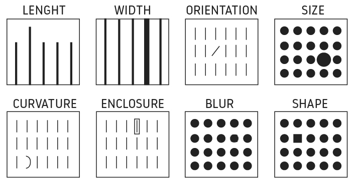
The form category has many sub-attributes which can be easily be used and modified to either draw or reduce attention to a value/characteristic of a data set. Some of these sub attributes are:
- Length
- Width
- Co-linearity
- Curvature:
- Added marks
- Numerosity
- Shape
- Size
- Orientation
- Spatial grouping
For example, you can use size to indicate importance or enclose an element to highlight its importance in a data set. Though size and length are usually the most used options in data visualization, consider other categories. You may be surprised of the infinite combinations of visualization options. Keep in mind one tip: area is one of the worst ways that our brain receives the data information as we find it very hard to compare size, even though we usually love pie charts!
In the image below, you can see some of the different ways visual form can catch the attention of a viewer:
Color:
Color can be described using different scales. Among the most commonly used scales are the RGB (Red, Green, Blue) and CMYK scale (Cyan, Magenta, Yellow and Key). Most people are familiar with the RGB scale in digital designs and CMYK in printed designs. But preattentive processing also includes the HSL scale (Hue, Saturation and Luminosity). While Hue refers to aspects of a color we usually name “blue” or “green”, Saturation and Luminosity are measures of the intensity of a color.
Hue is the property that is most easily processed preattentively when using very distant colors. Intensity and luminosity are useful either but should be used more carefully: the brain finds it harder to differentiate data with the same color hue but different intensity, specially in visualizations that contain a lot of information that the viewer needs to compare.
Color is powerful for getting the attention of someone. The correct use of colors can help direct the viewer to important information, though it must be used delicately. Though an easy first option, we have to consider other option beforehand and resort to color last to ensure the design works in black and white too, when possible. Keep in mind that there is a high percentage of colorblind people whereas everyone will be able to distinguish a triangle from a circle. Also, color is subjective and can be learned!
Below is an example of use of color:
Spatial positioning:
Spatial positioning could be described as the ability to discern the position of two or more objects in space relative to each other. The main preattentive attributes for spatial positioning are:
- 2D positioning: Is considered the most accurate attribute representing quantitative data to be processed visually.
- Stereoscopic depth: Humans perceive depth by combining images generated by the left and right eyes. This depth is preattentively processed. Stereoscopic depth can be replicated in a computer a computer using two different cameras or two different screens when visualising (a good example of this are the world famous Oculus Rift goggles).
- Concave/convex positioning: This effect can be create in images through the effect of shading. We are accustomed to primary sources illuminating our surroundings from above (the sun, street lights). This is why images with shading at the top are interpreted by our brains as a cavity while images with shading at the bottom are interpreted as a bump. The image below is an example of this.
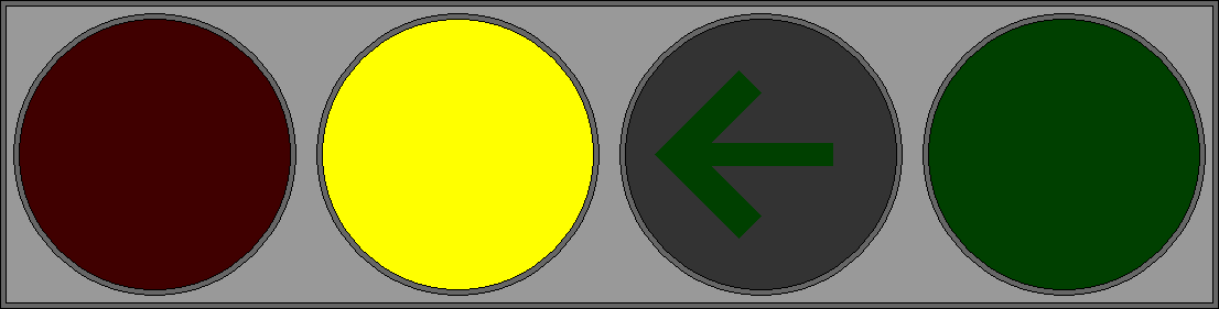
Motion:
Motion has two main sub-attributes: flickering and direction of motion. These attributes are very effective at attracting the attention of a user. Take, for example, the traffic light image below. When it first appeared on your screen I bet you were instantly drawn to it. This type of motion is highly preattentive. However, you should be cautious when using motion in your visualisations as it can quickly become distracting and annoying. Even the below image may start to be somewhat distracting in relation to this blog!