Recently, great results have been achieved by processing data with deep learning techniques, and, specifically, by using convolutional neural networks (CNN) with images as input. This neural network’s great performance for reading, processing and extracting the most important features of two dimensional data have highly contributed to its popularity. However, even in scenarios where input data isn’t formatted as an image, many transformation methods have helped apply CNNs to other data types. Time series is one of these data structures that can be modeled to approach the problem from a computer vision perspective.
Spectrograms are one of the most popular representations for signals, in which time series carry information with time and frequency as magnitude dimensions. Though spectrograms are graphical representations of frequency spectrum over time, some nuances exist between these graphical representations and pictures taken with a camera, or paintings. For example, when observing a landscape image, near pixels normally belong to the same object. However, in spectrograms, local relationships are represented using a different domain. Overall, this slight concept complicates the local feature extraction feeding two-dimensional CNN layers with spectrograms, as they have non-local relationships, unlike pictures. We can only take advantage of 2D CNN considering visual representations with inherent spatial invariance as they efficiently provide the best input for a convolutional layer.
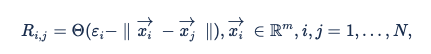
Data scientists commonly work with sets of data representing temporal series, e.g. the historic evolution of a trend, a magnitude measured by a sensor or daily tracking of any source rich for analysis. Moreover, this information is usually composed of multiple variables, as different aspects of the scenario are measured. Recurrence plots are an advanced technique for visually representing multivariate non-linear data. In essence, this refers to a graph representing a matrix, where elements correspond to those times at which the data recurs to a certain state or phase. Recurrent behavior, such as periodicities or irregular cyclicities, is a fundamental property of deterministic dynamical systems, like non-linear or chaotic systems. As higher dimensional datasets can’t be pictured easily, they can only be visualized by projection onto 2D or 3D sub-spaces. Recurrence plots enables the visualisation of the mm-dimensional phase space through a two dimensional representation of its recurrence. This recurrence of a certain state at time ii at a different time jj is marked within a 2D squared matrix and can be mathematically expressed as:
The main advantage of using recurrence plots is being able to visually inspect any higher dimensional phase space trajectories by obtaining an image that hints at how the series evolve over time. Thus, depending on how the time series projection looks, we can distinguish four different topologies:
- Homogeneous: typical of stationary and autonomous systems. For example, randomly generated time series.
- Periodic: oscillating time series. Even for systems where oscillations are hard to recognize, they can be seen in the recurrent plot.
- Drift: typical of systems variables with slow variations over time.
- Disperse: these plots show abrupt changes, normally due to extreme events in the data. Recurrence plots help detect anomalies or rare events hidden along the series
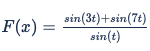
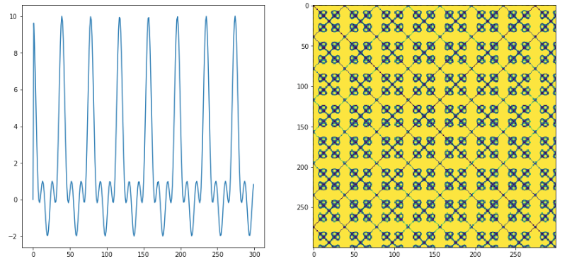
For example, the recurrence plot for the following function (below) would be:
The periodicity of the signal can be observed in the recurrence plot repeating the same pattern over the 2D space. Most of the oscillating systems present this mosaic architecture with diagonal oriented lines, which means that the states’ evolution is very similar at different time points. Additionally, anomalies are drawn as single, isolated points, and vertical or horizontal lines mark a time length where the state stays constant or changes very slowly.
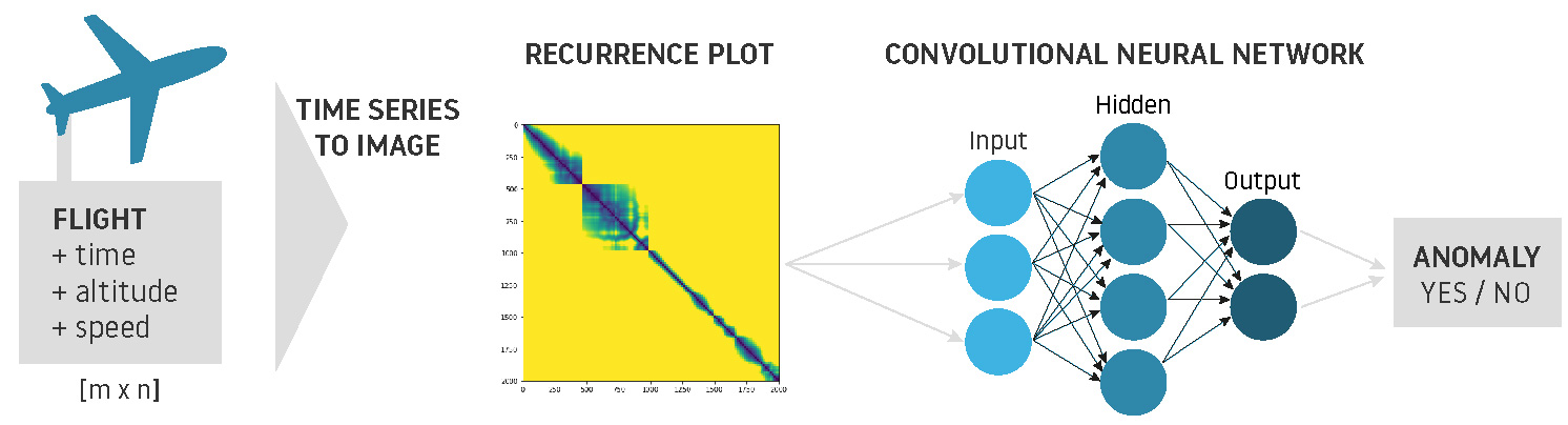
Of all recurrence plots types explained above, disperse structure has huge potential as it detects hidden anomalies at a glance, revealing them after transforming the time series into 2D images using recurrence plots. This way, we can process historical data and create 2D images to feed CNN, detecting a rare event within a fixed time period. For the CNN, this procedure is identical to recognizing shapes drawn on an picture or identifying a human face.
In the aviation industry, multiple data sources are recorded as time series. During flights, aircrafts record the status of multiple magnitudes (altitude, speed, etc.) and save the data provided by sensors almost every second. Similarly, ATCOs monitor airspace traffic, measuring sector occupancy evolution over time. The graphical representation of a multivariate dataset could reveal new features that were unnoticeable during data exploration phase. For instance, recurrence plots could detect abnormal behavior in one of the aircraft components and replace it beforehand, or even identify anomalies during landing and take off procedures… all by processing images!
sum, being able to detect hidden features from pictures is definitely an incredible enhancement when dealing with time series. However, some inconveniences proceed from excessive numbers of dimensions. As we commented above, recurrence plots are good for detecting imperceptible features for input data. Sometimes, however, this can lead to noise addition to the image, raising a lot of false positives and negatives. Thus, it’s important to select columns identified as precursors for the anomalies we want to predict in order to avoid noise that can confuse the neural network and render the output meaningless.